I am glad; thank you for taking my input into consideration.
Assuming you had a WiP thread that had feedback in it while writing/developing your game, the nesxt step is to officially submit your game into HG.
Follow the instructions on the HG publishing page.
You can keep your demo/game up and open for further feedback once submitted, but you can also pull it and close the WiP thread as well; the choice is yours at this point.
Okay, well, January’s been pretty good. My WiP is out in the open, and I’m doing steady progress. It’s been getting easier and easier with every word I write, since I can now see how every plot point connects, instead of just having a bullet list of them.
I’ve also managed to crush my way past a major roadblock, having finally figured out how a certain part of the story will make sense.
Aside from that, hm, I’m trying not to burn the midnight oil too much. I cap myself at two thousand words per day or so, and I take a one day break after every update, in order to get myself some breathing room.
For now, at least, everything’s looking up Juan.
Goals for the rest of the month:
Keep my current writing pace.
Finish Chapter 2.
Keep hacking away at coding, making sure I don’t have too many redundant lines and all that.
I just saw this and wow! Uh, thanks so much. I really appreciate the positive response that Fairmont has been getting. It means a lot.
I have had some health setbacks, so I’m not sure I’ll meet all my goals this month, but I’ve been keeping busy and making what progress I can, so I’m optimistic. And of course, current events are getting gradually less stressful and, uh, back to the regular background level of worry. So I’m hoping February will be even better.
I’ve hit the inevitable moment, I’ve realised that one of the central pillars of the game/story don’t really work and needs a major re-think. Fortunately a decent sounding new angle came to me pretty quickly. But here is often where my projects end up dying, because I lack the motivation to re-work so much stuff.
I’m already spiralling. The updated idea has been discarded and I have moved through three other ideas in quick succession. So have just gone downstairs to get a Magnum (ice cream, not a gun!)
I’m going to circle back to the original idea and make it work dammit.
@Sinnie Good luck on the rework. I’ve had to do it several times on my project. One of my reworks was a massive disaster but I’ve learned to love rewriting.
My advice is to take a day off. Then prepare all the icons and the text you will use to sell your game. Then do the needed forum beta.
Then after 4 or 5 days beta going well. Then contact with Hosted
Edit Why? Because you need both the text and icons as required by the staff. Also, the beta will help you to think about what will be the demo for the final product. More info is key for you.
Hello all! I’ve been following COG for the past decade or so and finally decided to write my own. I think posting here will really help with my motivation and accountability, so… here I am. Right now I have a grand total of 500 words. Here’s to many more!
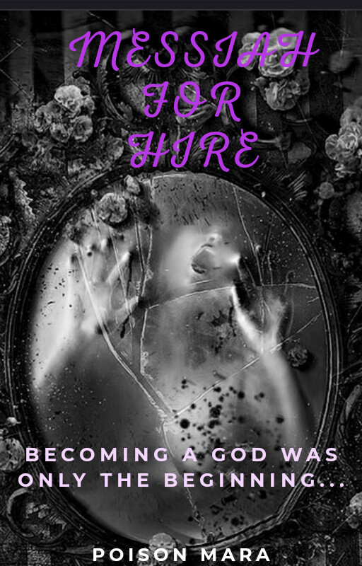
Composition of the first one overall seems better, I think. But I don’t like how dark the purple of the title is, especially combined with the font being the skinny type, it’s can be hard to read because there’s not enough contrast. I suggest making the font size larger and/or bolder. Maybe also make the font colour lighter too to match the lighter text below, and stagger the three lines to avoid the lightest coloured flowers instead of making them all centered.
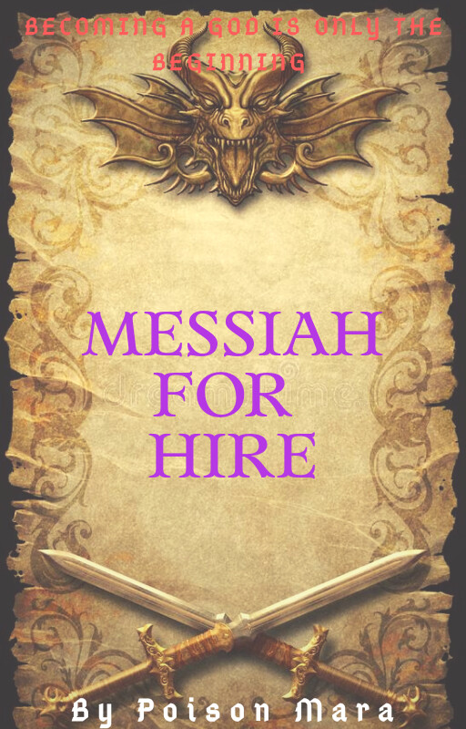
For the second one, considering the rest of the background is done in golds and browns, the bright purple title is super out of place. A dark reddish-brown like the colour of old ink would be better, I think. I’m also not sure about the red for the tagline… it’s very hard to see. Composition-wise it looks cramped on the top and bottom, and I think it would look more balanced if the dragon and the sword were moved closer to the center to surround the title text.
Yeah, I agree with you I have to change The title letters in the first one. I probably go with lighter purple and shadows to empathize the title against the background.
Mmm… The left one gives me more “Dark” and “Horror” vibes. The right one gives me more “Avventure fantasy” vibes, and I also think the words palettes are completly wrong (orange and purple in golden background are a punch in the eye)
yeah, I left that one behind as I don’t think it fits the story, I will use the background as an object background asset, as I will use as an old letter background of an invitation to a castle. This game has a visual inventory player can access and visualize, so graphic of objects and multimedia stuff is important for the story.
So I have to design and planning objects and visuals with the story. Thing is very useful to learn how making games as a whole
Second version of the title cover