(If this isn’t the appropriate category, please move)
We recently got a couple of threads about what makes the characters interesting, the game replayable and so forth.
But what about the cover?
What kind of cover/icon image gets you interested before you even read the summary?
To me it’s usually covers that raise questions about a game. Tally Ho or Aetherfall are great examples.
I’d even give the first HR cover credit here, and would go as far as to say that the cover of Hero Unmasked is the only minus I would give that game.
Not much a fan of the generic groupshot/character image.
It’s not all that much to work with, but bright colors really capture my interest.
Also, if there’s a consistent, eye catching style, I suppose? The picture has to be readily apparent to me as well, so ‘crowded’ images with too much detail tend to draw my ire.
Something that relates to the story - I am a fan of the paperback scifi/fantasy novels of the past, so I always enjoy that type of cover but something as simple as the tin star of Tin Star is a favorite of mine as well.
Usually, I appreciate the cover more after I read the novel than I do at first.
I know that the artist I worked with, Jack Uzcategui, specifically mentioned how much he liked the Aetherfall image when I had sent over examples to him of other CoG and HG cover art.
Seemingly random items that pertain heavy meaning within a story, such as a broken wine glass on the cover. Said wine glass is then the sole piece of evidence you have against the antagonist serial killer.
I appreciate a nice cover of course (my favorites are so far the cover of Superlatives and Heart of the House), but normally I try to judge a game based on the description rather than the cover art. I think that comes from my experiences with books. Many times I’ve read books where the cover was poorly made imo, but I was glad that I still gave the book a chance, bc if I’d have judged based on cover only then I’d have passed up on a good story.
Tho still I admit there are a few HGs which cover pictures I found so horrible (sorry for the strong word) that I didn’t even read the description.
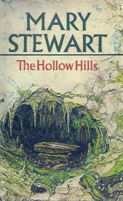
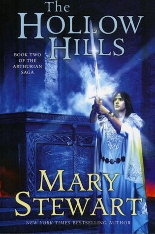
I agree, I’m more likely to pick up something with a nice picture, but I’ve spent enough time over the years rummaging through books at fates and markets not to pass up the crappy ones. Example time: One of my fav series growing up was the Authurian Saga. I noticed that they’ve been given a (much needed) facelift when I searched for it just now. This is what that cover of what I think is the worst one in the series that I read looked like, and below it is the reworked version. (Not brilliant, but a whole lot better IMO). I mean which one are you more likely to pick up first?
I mean seriously, yes there is a cave in the story, but in the picture it’s dull and boring (In the story it’s full of crystals). Which publisher actually ok’ed it? I can’t imagine how many people didn’t read it because of the cover.
Anyway, I like relevant and eye catching as well. I think less busy also tends to work better for most (although there are exceptions of busy pictures that look really good) particularly due to the small size of the images. What is “good” though depends on the story, some are great with bright or bold colours, some can be good just by being different to all the others so it makes me stop and wonder what it’s about. Like the cover of demon mask was cool largely because the style of artwork was so creepy and different. I love the bold simplicity of Sea Eternal. Iron destines looks really bold and eye catching enough that I wanted to see what it was about. Anyways I don’t think it’s a one size fits all thing for games, and depends on the story and artist style for what it needs artwork wise.
I don’t think the first book cover is that bad. Sure the second one is better, but even with the first cover I wouldn’t leave it just there if the description is interesting. And since descriptions are so important to me, I find it annoying when instead of the description they just print others opinions on it. I mean we are all people our tastes differ so how am I supposed to judge based on what others say instead of giving me a short summarization of the story?
Anyway if you think that cover is bad than what about this one?
Sure it’s a romantic story with a sci-fi setting. And imo the romance genre has by far the worst book covers. Still I enjoyed the story so I didn’t regret that I didn’t put it back on the shelf just bc the cover.
Not sure if it makes a good cover, but a simple symbol (or logo, herald, banner, such stuff) is enough to get me interested. Bonus point if said symbol pertains to something terrifying in the story.
Ok point taken, I wouldn’t have even guessed that had a sci fi setting and probably never picked it up at all. I agree romance genres tend to have some terrible covers.
Yeah I know, I’m looking for the blurb and all I can find in some books on the inside covers is a list of people (whom I often have no idea who they are) talking about how wonderful they think it is, instead of having a paragraph about what the book is actually about.
I actually like the artwork for Hero Unmasked. (I think the style of the artwork fits the genre very well.) I suppose I appreciate things like that in cover-art. Comic book images for a super hero game, black and white (film noir style) stencil art for a detective game, whimsical art for a comedy… Little details like that.
Just scanning through the CoG titles though, I’d say that some of my favorite covers are: Choice of Rebels: Uprising, The Eagle’s Heir, Pendragon Rising, Hero’s Rise: Hero Fall, Choice of the Deathless/ The City’s Thirst and Choice of the Vampire.
What do all these covers have in common? … Honestly, not an awful lot, as far as I can see. I just kind of like them.
I actually think it got worse… The first is a little bland, sure, but it’s quite atmospheric, while the second one just says “this is a super-generic fantasy novel cover”…
Blinks. It’s certainly imaginative and memorable.
Is he/she (sorry can’t quite tell) wearing… rainbow bird feathers instead of a full helm to war? And those metal shoulder pads… wow! Was this published in the 80’s by any chance?
I like the colors on this one. Also +1 point for the fact that even the front of the book already says something about the the story (aside from the pic and the title of course).
Yeah I must admit, the more I look at the second one, the more I’m going off it. The bad shading with regards to the light source is driving me crazy, the aspect is off in his shirt, the placement of the belt looks weird somehow and the expression on his face is kind of like. “Hey here’s excallibur. Yay for me I guess?”
If I’m honest, I’d probably still pick it up first though if there was a big pile of books to sort through. I really wish they’d at least drawn Merlin into the first one placing the sword there or something, it’s just so bland and it’s like they told the artist to be careful with the number of colours they were allowed to use.
I thought that was a girl/woman holding up that sword - even after knowing the title… (laughing at myself so hard right now) that brought tears to my eyes. lol. I can understand not knowing my cover but yours? lol.


 Magium


 …
…