I’ve been thinking about this for a little while now, and I fully expect this broad of a question to get answers along the line of “It just is or it just isn’t.” Which is fine! I think there are some obvious elements to good cover art that we all recognize, just as most people can agree on (or can they?) about what looks good or what doesn’t. Like polish! I think we can all agree that a more “polished” cover art is more attractive than one that isn’t.
But what other elements about a cover draw you into a game, or make you want to click on it in the storefront?
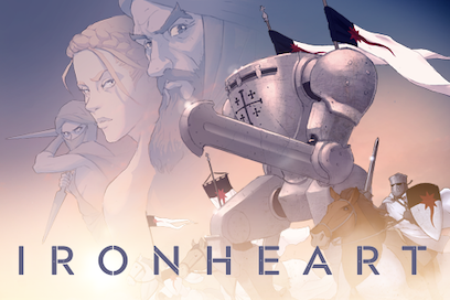
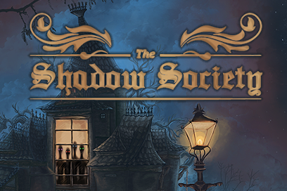
Is it bright colors or moody atmospheres? How do covers like a Squire’s Tale fare against covers like Mask of the Plague Doctor?
Examples


Is it style? Are cartoon-like or comic book-style covers more or less popular than realistic or painted covers? Or abstract vs. figurative?
Examples


Is it adherence to and conveyance of genre? Are covers that are very indicative of their specific genre more appealing, or do the ones that encompass a broad scope of possible stories draw in more curious readers?
Examples


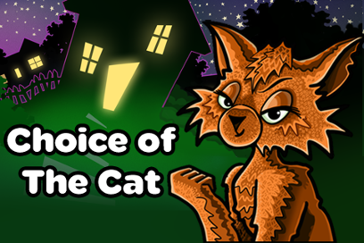
Is it subject matter? I used to think covers had to feature specific and central characters for me to be drawn in by them, but it turns out there are a lot of COG games that did not feature a “person” that I had no problem being engaged by!
Examples


Or do you ignore the cover art and go by title and summary?
I’m very interested in hearing people’s thoughts on this! What draws you in when looking at all of the different covers on the storefronts? What makes a game stand out to you, just by its cover? Put another way, what’s one thing or the most important thing you need in a cover for you to want to click on it, if applicable?
(This is not an invitation, by the way, to bash any specific covers or games, as each of them are the product of someone’s hard work and artistic creativity. I also happen to think each and every cover I’ve seen is incredible in its unique way!)
(Also, I used COG covers for this post, but in case anyone doesn’t know, these are just the promotional images that appear on the COG website–you can see the full, larger versions in places like the Omnibus app and admire their full beauty there! I say this because some examples I used as “not having people” do, in fact, have people in their full renditions.)
 )
)


 . so it remained for me a good surprise that at first wouldn’t pick up with great hopes just for the cover. Same concept could be applied in reverse for CoG titles (not everything that glitter is gold
  ) so in a way my suggestion is go with your guts and pick genres you like without prejudices
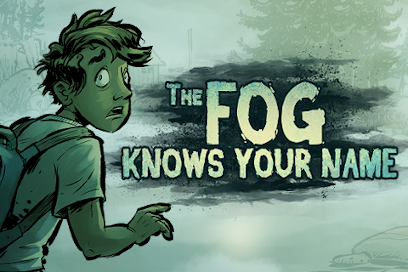
 Is clear having limited funds that the cover choosen for the game make at first a difference in the choice the buyer/reader make in picking up the game… personally I love the covers with cartoonish light tones and are loyal to portray their theme by giving glimpse of the characters in it. For Example: Fool!, The Fog Knows Your Name. Sixth Grade Detective, NOLA is burning. Different genre but the theme is clear even if the cover is less realistic.