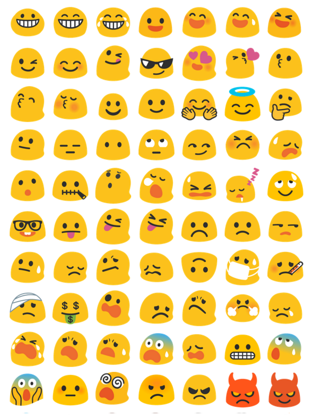
I’d rate them:
Twitter = Facebook Messenger > Google > Apple > Google Classic > Windows 10, although I’d be fine with any of the top four.
Thoughts
Twitter: minimal, flat, and modern. The minimalism and slightly-larger facial features give them the best overall clarity, IMO. However, the lack of borders/shading/shadows means their emoji have the least contrast when the emoji color is similar to the background color. E.g., the skin tone 2 emoji on a white background.

Facebook Messenger: more detailed shading makes the facial expressions slightly less clear, but improves their emoji’s contrast against backgrounds. This is a pretty good trade in my book, so they tie with Twitter for being my favorite option. I really don’t understand what happened here though:


Google: while I personally think the gradient is very dated looking, they’re decent. Very similar shading to Facebook’s, but Facebook’s drop shadows and greater willingness to “break the outline” gives them a slight edge in clarity. E.g.,
![]()
![]()
Apple: a lot of details and look the most 3D. While pretty, it makes everything look smaller. However, I do think their skin-tone emoji have the best clarity and contrast. They are also the most consistently designed.
Google Classic: aka the blobs/thumbs. I admit I have a soft spot for these guys; they look like little slimes.
But since they’re discontinued, they don’t have and won’t get any of the newer emoji. Discourse is using Twitter’s emoji to fill in some of the gaps, but I’d prefer to go with Twitter’s in the first place.
Windows 10: they sure are… something, alright. I’m really not a fan of that black border. It eats into the size of the emoji and the negative space around the emoji, reducing clarity substantially.
They’re semi-passable on mobile, but truly awful on desktop, when you’re further away from the screen.
![]()
![]()

