Only if you’d have a choice to turn the animated images off!
1 Like
stuff like that should always be optional.
1 Like
I’ve tried the slice effect, but can anyone else try it? The site I use is Photopea but it’s just not working…
looks eerily…stunning…
I tried to do something like the Death’s Game poster.

Edit: And I don’t know how to spell. ![]()
Fixed

10 Likes
That looks really good! Though yea it’s spelled Vengeance, took me a while to memorize that. ![]()
You wouldn’t mind if I used it? ![]()
1 Like
Yeah, go ahead. The gun is from here. It’s CC lisence, so you have to give proper attribution.
2 Likes


11 Likes
You may use Icons pursuant to the applicable license for each Icon as identified on the Services. Icons are available under one of the following licenses:
- Creative Commons Attribution License (CC BY 3.0). This license allows you to use the Icon for free through the Services, as long as you attribute it to the Icon creator. For more details on the Attribution License, see Creative Commons at CC BY 3.0 Deed | Attribution 3.0 Unported | Creative Commons.
1 Like
Because I can’t afford to pay for it ![]() I made my game’s art using the free version of adobe fresco. I have an old ipad/stylus and I chose the program for the fact that it has shape guides. I don’t know if I’d recommend it, but it worked for me. Then when I realized I’d done it all in a way that I couldn’t resize the art, the wonderful @MeowMeow422 helped me out with this. She’s amazing, I still can’t get over how fast she did it and how good it looks.
I made my game’s art using the free version of adobe fresco. I have an old ipad/stylus and I chose the program for the fact that it has shape guides. I don’t know if I’d recommend it, but it worked for me. Then when I realized I’d done it all in a way that I couldn’t resize the art, the wonderful @MeowMeow422 helped me out with this. She’s amazing, I still can’t get over how fast she did it and how good it looks.

5 Likes
Hmmmm…
Odd choice of colors for that background.
I would have put ‘Leas’ inside the Sun…and changed the background…to a sunset or something…like a desert…
1 Like
That really is beautiful!
1 Like
It’s too late to change it now, but I appreciate the critique ![]()
Thank you! ![]()
3 Likes
Not a critique, but someone with too much imagination ![]()
2 Likes
No such thing ![]() Maybe I’ll post my book 2 art here for suggestions, when I make it. We could brainstorm together
Maybe I’ll post my book 2 art here for suggestions, when I make it. We could brainstorm together
I don’t actually remember the intent, but I pulled the image from the trailer I made for the game (the smoke moves in the video and I liked that effect a lot). Also bright colors on screens hurt my eyes, so I suppose I’m inclined towards using dark backgrounds.
Those are cool! A little more cyberpunk than I’d be going for but I love the vibe. And they’re much easier on the eyes than what I was picturing.
It’s all Greek to me, dude ![]() Art is so difficult to me.
Art is so difficult to me.
2 Likes
though, your sun look like its falling in the Abbyss now…was that the Intent?
Yeah, I know what you mean…I live under a rock. So you can guess lol
But I wasn’t thinking Bright. (I would die if I did)
Something similar to this…


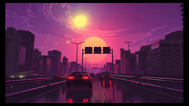

As you can see, Sunset doesn’t automatically mean ‘Glare in your bleeding eyes’ lol
3 Likes
Was wondering why I got a ping. Thanks for the referral lol. Appreciate it /gen
But in all seriousness, I only redrew and resized a symetrical design; not that hard.
Fair enough
2 Likes
@cup_half_empty @ChanceOfFire @E_RedMark
I know this was a bit a of a post resurrection but I was thinking about that image and if you wanted that effect (but can’t use it because of the copyrighted photo, could possibly pick a seashore one, black/white it, copy some of the wave textures over the the other side and try to recreate it. Might have to hunt for the right photo to have one you’re happy with, but this is one I had a quick fluff about with because I was curious if it would work. (Original stock https://pixabay.com/photos/beach-sea-ocean-shore-waves-5234306/ )

Edit- I just realised this is @KoegeKoben game. I’m losing track of whose WIP’s are whose!
5 Likes
I didn’t make it so it’s probably a question for @cup_half_empty .
On an unrelated note, I found a tutorial for a fire effect online.

I might use this thread to upload some crappy art for Dragon of Steelthorne 2 and get some feedback. I’ve done the full set but it’s kinda plain when I look at it.
3 Likes
This should work too ![]() . I was just playing around with it because someone had mentioned it, but I don’t know whose wip it is either.
. I was just playing around with it because someone had mentioned it, but I don’t know whose wip it is either.
2 Likes