Meanwhile, I have time for one more simple piece of cover art for another WIP I’ve tried, leaning on CC0 resources again.

(It’s not fox pelt, but I’ve gotta improvise since free stock images don’t quite give unlimited options)
Meanwhile, I have time for one more simple piece of cover art for another WIP I’ve tried, leaning on CC0 resources again.
(It’s not fox pelt, but I’ve gotta improvise since free stock images don’t quite give unlimited options)
that just scream ‘Fire! Fire in tha barn! Where is me axe?’ ![]()
Can’t unsee ![]()
In hindsight, maybe I should have tried something besides the fire effect… Maybe a lightning bolt or magical lines.
I personally think that less is more. Sometimes a well-chosen font on a solid color background is enough. Too many elements can clutter an image and ironically make it less appealing.
I’m just teasing, but odd choice considering the Title. No?
Does the story has Viking? War?
The beauty of pictures is that it can translate many things. Not just the one thing.
Meaning, you have the freedom to pick whatever will represent your story or game. Some people like to be direct, they will make Pictures about the subject in their stories. Example: A game with Wizard and spells? And the pic has a tome and a Magic wand.
Some people will try to be subtle. Some have too many things to be able to nail down just one thing and go with a picture that either represents one thing…or an ensemble of things, or just leave it vague at best.
I give you an example that is solid. One of my story has the setting in Viking like world. There are clans and tribes and Queens and Chiefs. There is war, and there is a lot of history. They all look and sound Viking, save for a few things: they say Malaka a lot (Lol), there is also Magic and weird abilities for each clan, and there are Elves who speak English (because the author is a lazy Asshole who refuse to translate the Elfish Fish lol)
Now, I went for a Title that is telling and not telling at the same time. The Road to Valhalla.
And this is the Pic I made for it.
As you can see…it work for me just fine ![]()
So yes, think about it and let the muse do it’s wonders lol
A trap that’s always too easy to fall into.
It’s a unique historical setting… not sure how I’d describe it. The title was changed once during development, in hindsight, I’m not too sure of the title.
Not so much of war, but more of personal struggle and conflict. You can always give the WIP a go if you’ve got the time ![]()
Dragon of Steelthorne?
Nah… I meant The Shore of Two Seas
If you want to see the art for Dragon of Steelthorne… it’s all here:
https://steamdb.info/app/2805490/info/
sorry, its gender locked and has trigger warning for sexual assault. Nope.
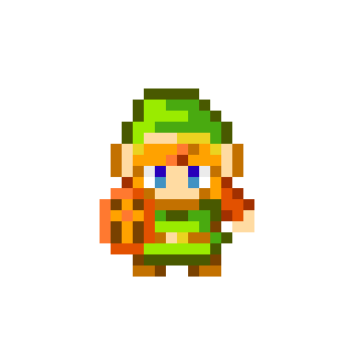
Did you make that??? Aw, look at that sword! Remind me of Link!
Then add something like this in the back…
I like how you incorporated the weaponry into the title! I’ve always wanted to try something like that but Idk how.
Just remember that if you’re aiming for HG release, not all images can have text!
you making fun of meh Senior? Watch it! I got itty bitty legs and grabby hands! Oink! ![]()
Ooh, thanks for that icon resource! I’ve been using Font Awesome, but the free version is very limited.
Nice! @ChanceOfFire what do you think?
There is true beauty in simplicity. ![]()
Although I can’t remember if there were shields in the game…
Don’t forget that CC icons may require attribution and a link to the license. ![]()


